
Mobile Responsive Web Design & Development
Welcome to the age of responsive web design. Gone are the days of desktop.
In today’s mobile world, we need to present our online presence in such a way that what is seen on the devices or screens does not do damage to our brand.
 We must consider the plethora of choices for mobile usage, whether dumbphones (which aren’t as dumb as the old days), smartphones, tablets, and whatever the future may hold. Or, what will Microsoft’s HoloLens do to our future online presence?

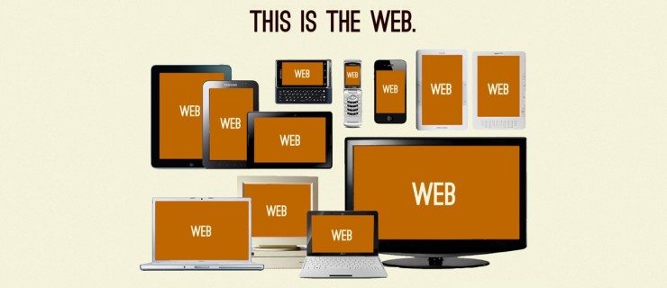
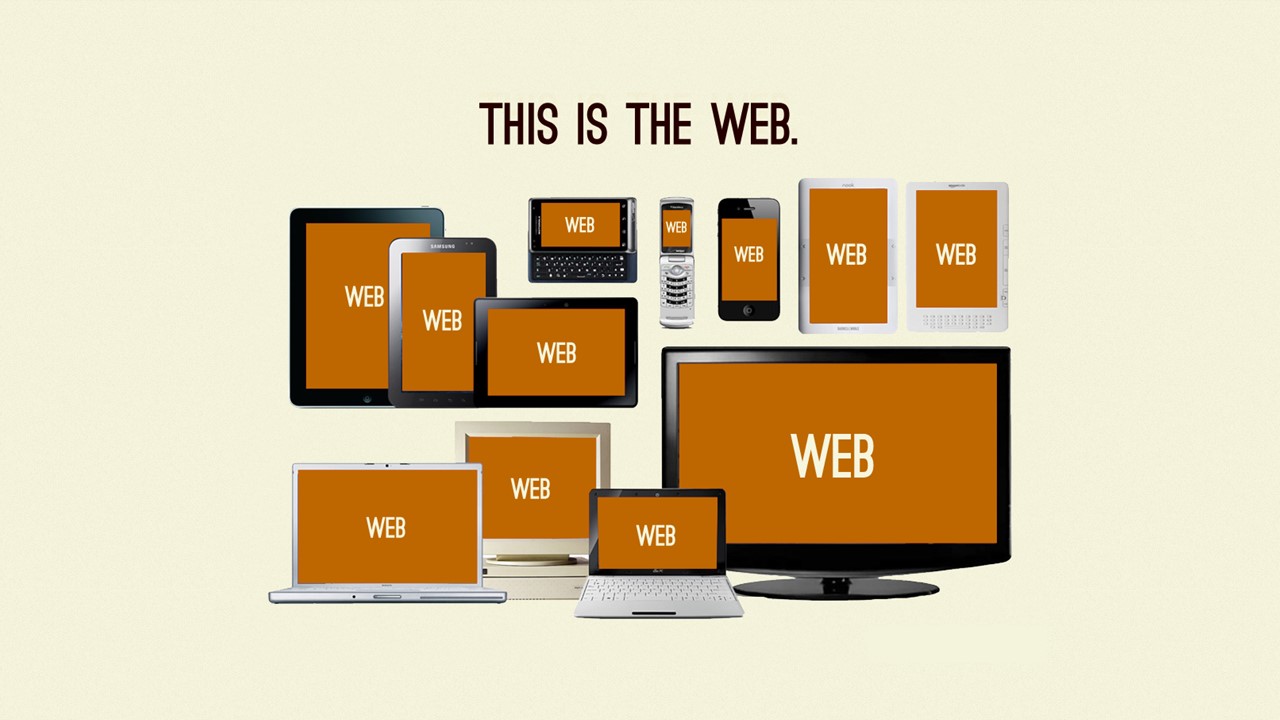
As we engineer future solutions today, we must come to grips what Responsive Web Design is. First let me start with an illustration (see also an architectural conceptual illustration).

Most of us know that chameleons change colors to adapt to their environments. A lesser known king of adaptation is the Mimic Octopus (or these other Kings of Camouflage). These color changing animals (Chameleon, Mimic Octopus, and the Cuddlefish) adapt to their environment. Likewise, Responsive Web Design is the ability for a web page to adapt to its environment, that of a browser on any device.
So what is Responsive Web Design (RWD)?
Responsive web design (RWD) is an approach to web design aimed at crafting sites to provide an optimal viewing experience—easy reading and navigation with a minimum of resizing, panning, and scrolling—across a wide range of devices (from desktop computer monitors to mobile phones).
Responsive web design (RWD) is the approach that suggests that design and development should respond to the user’s behavior and environment based on screen size, platform and orientation
When we think about Responsive Web Design, there are three essential pillars and best practices for responsive development.
Pillars of Responsive Web Design
1. Flexible Media:
No fixed widths but widths that scale with the grid
All media (even content for that matter) should be fluid. Images and videos should be responsive and flexible. Videos are often placed inside iframes, which by definition are not responsive at the time of writing this. However, with libraries like fitvids and NPR’s Responsive IFrames and services like Embed Responsively, it is much easier to ensure your content is responsive.
2. Fluid Grid:
Grid units that resize according to screen size
There are a plethora of libraries that have responsive grids, including the infamous Twitter Bootstrap and Foundation. Here are a few other CSS Grid Frameworks:
-
- Starbucks Style Guide
- baseline
- Atlassian User Interface
- tuktuk
- Pure.css
- Gumby
- Skeleton
- Base
- Amazium
- Responsive Aeon
- Groundworks
- Kube
- YAML
- Susy
- 960gs
- Ingrid
- Toast
- Columnal
- Gridiculous
- Less Framework
- responsive.g Responsive Grid System
- responsivegridsystem.com Responsive Grid System
- MUELLER
- Golden Grid System
3. CSS# Media Queries:
Selectively serve styles based on browser’s window size, orientation, screen resolution/size, color, and even viewing distance matters.
Previously, in CSS2, a web designer could only target media types (e.g., screen, print) for design customizations. So developers needed to depend on JavaScript alone to create mobile websites. Now, in CSS3, we have media queries
Most would agree that a browser’s window size, orientation, screen resolution (e.g., iOS Retina) and/or size matter. Many developers use sniffing libraries (e.g.,HeadJS: Browser Detection) instead of feature detection libraries.
However, Luke Wroblewski argues that we are too dependent on screen size when considering responsive web design. Luke notes that the average viewing distance on a smartphone is 32 cm (12.6 in).
This added element of viewing distance further complicates responsive web design and is not needed by all organizations and/or businesses. Here is a phenomenal graphic by Luke about Netflix and viewing distances per device.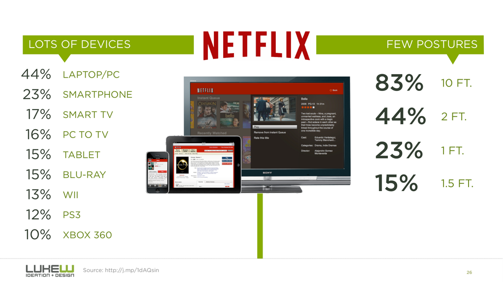
Now that you know the 3 basic pillars of good responsive web design, you are ready to begin working on creating awesome responsive web designs.